
2026
Keenova
Entrant
Prophet Brand Strategy
Category
Strategic Program - Product Launch
Client's Name
Keenova
Country / Region
United States
Gallery
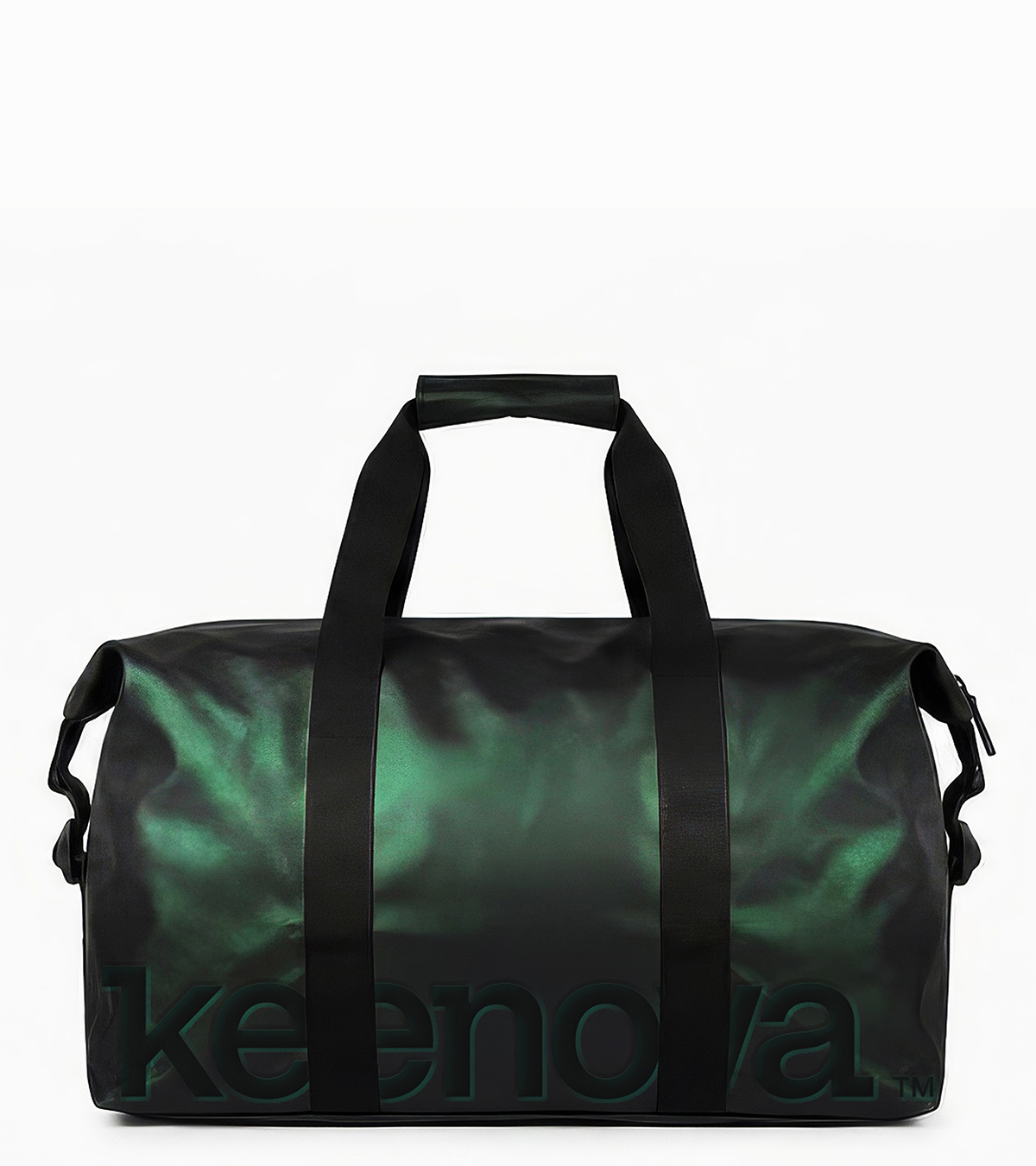
About The Entry
When Mallinckrodt and Endo prepared to complete a landmark merger—bringing together complementary portfolios while simultaneously spinning off their generics business—the path forward demanded absolute clarity. At a moment of profound organizational complexity, they partnered with Prophet to do something rarely attempted: build two fully independent brand identities from a single, newly formed corporate origin.
The challenge was both structural and strategic. Prophet began by investigating what truly set the branded therapeutics business apart—from the generics company it was separating from, and from the industry at large. The discovery pointed to one clear insight: patients and providers needed more across the health journey, and no one was better positioned to deliver it than the branded therapeutics business.
From that foundation, Keenova was born. A high-need branded therapeutics company built from the ground up, centered entirely on the patient. Prophet shaped a distinct positioning platform, including unified purpose and promise statements, core principles, and a strategic narrative.
The strategy directly informed the name. "Keen" signals sharp focus and insight. "Nova" evokes momentum and new possibility. Together, Keenova reflects a promise to change not just outcomes, but the entire healthcare journey.
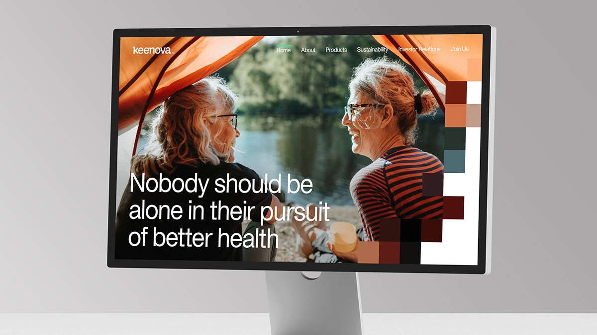
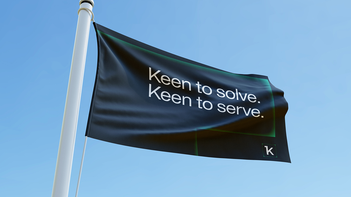
Prophet developed a verbal identity built to break through a complex, product-driven industry and reflect the genuine human-centered ethos of the brand—positioning Keenova as an assertive advocate that shows up for people when they need it most. The messaging centered on a core truth: Medicine can change outcomes. Keenova changes the journey. The tagline followed naturally: Keen to Solve. Keen to Serve.
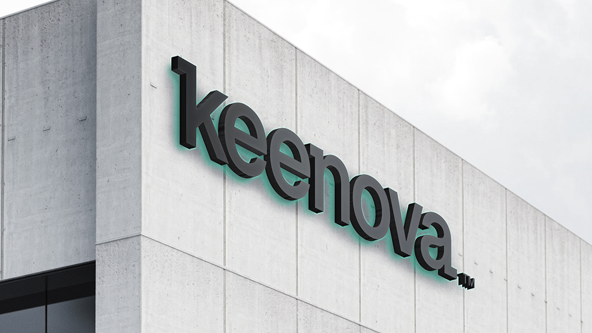
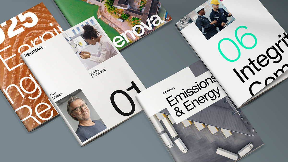
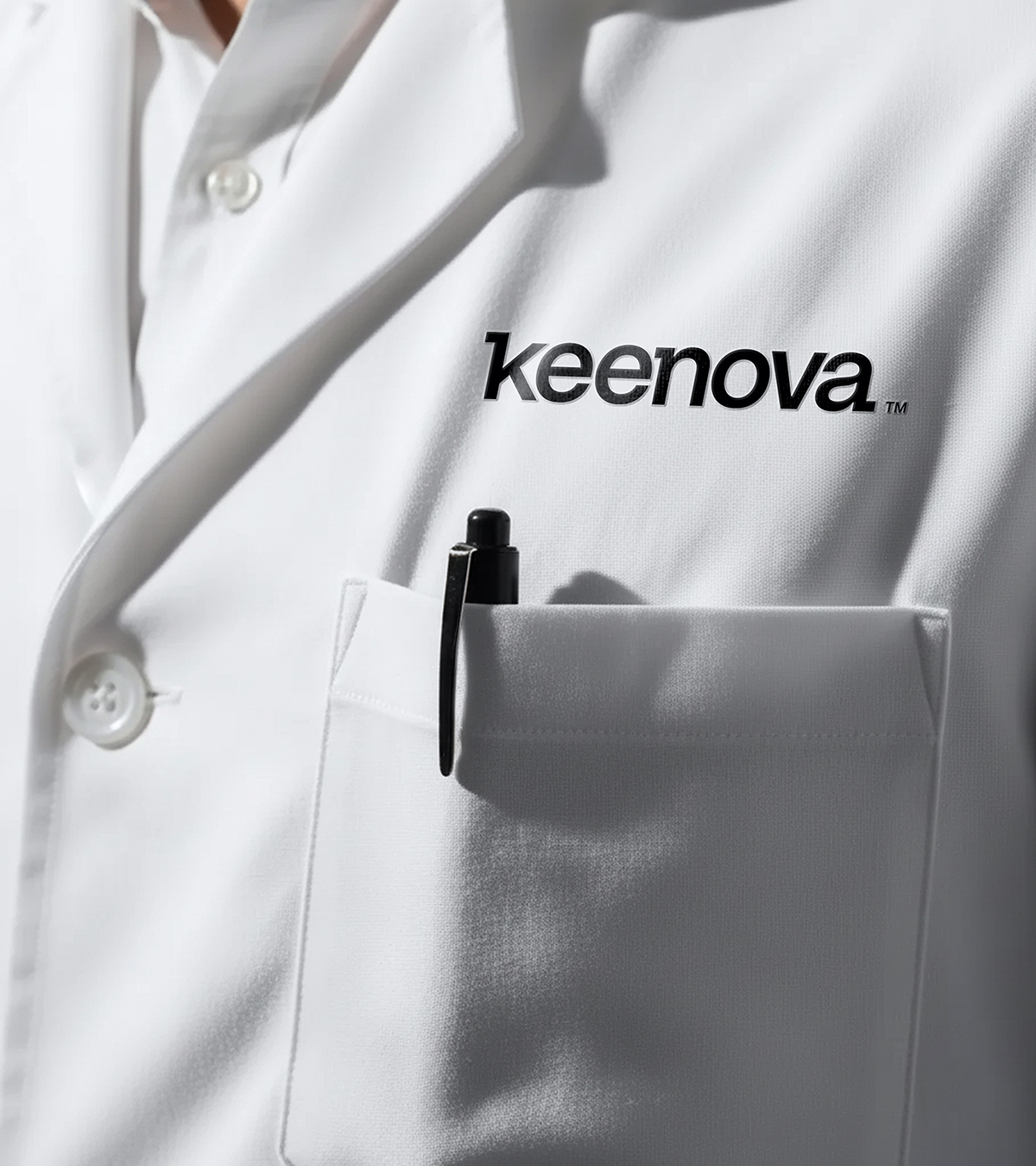
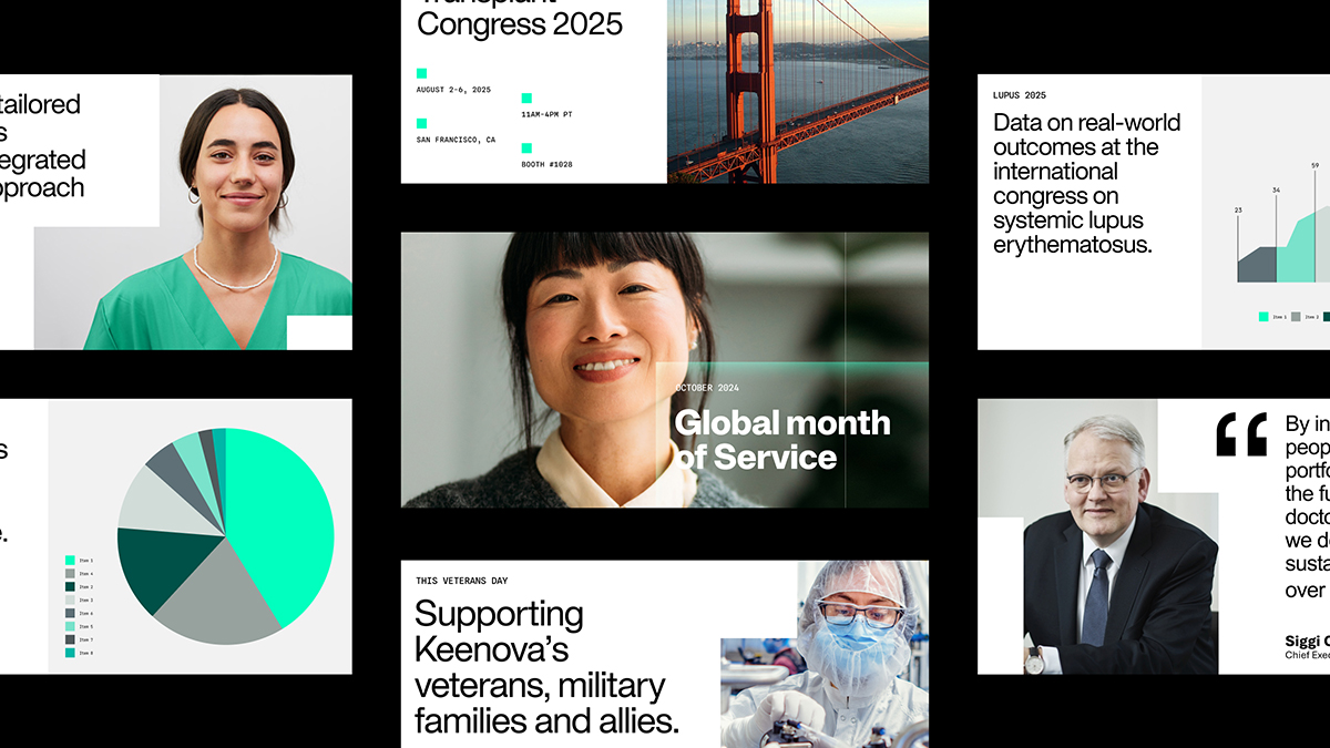
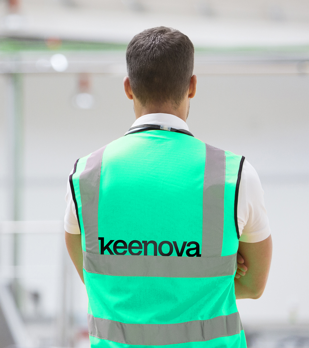
For a brand that designs for life and designs to heal, the visual identity had high standards to uphold. A custom wordmark and neural design framework — foundational and flexible. A color palette that evokes renewal, precision, forward motion, vibrance. Motion that feels organic, cellular, alive.
The result: a strategic program and brand identity built to lead with clarity, advocate with conviction, and design for better health.
Featured Media

Entrant
Gravity Global
Category
Video - Products
Country / Region
United Kingdom

Entrant
Savannah College of Art and Design
Category
Experiential & Immersive - Virtual Reality
Country / Region
United States

Entrant
Kai Tak Sports Park Limited
Category
Branded Content - Sports
Country / Region
Hong Kong SAR

Entrant
Pure Perfection GmbH
Category
Event - Sporting
Country / Region
Germany