
2020
Hardy Yards Apartment Homes
Entrant Company
Robinson Creative Inc
Category
Integrated Marketing - Company Branding
Client's Name
Greystar
Country / Region
United States
Affordable Housing After Hurricane Devastates Houston
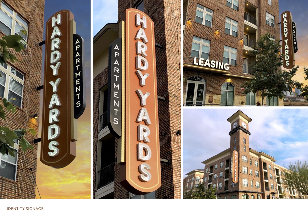
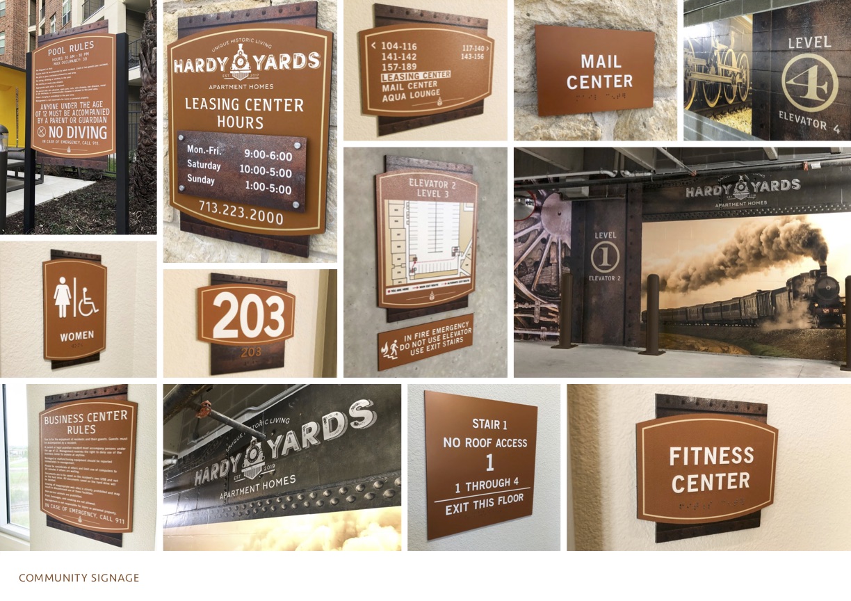
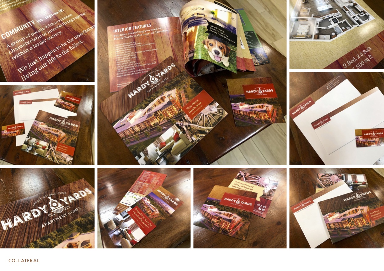
This urban housing project emerges out of the historic 23-acre freight tracks of Hardy Yards. The feel is timeless and inspired by another era. Colors are sepia, black and rich browns. Actual photos and textures are utilized to embrace the industrial age. Celebrating the site’s industrious past, the city of Houston invests significant energy and funds into revitalizing the area. The rich history is preserved through striking architecture and a signature clock tower, reminiscent of rail stations. A large blade identity with retro neon letters becomes the focal point of the iconic clock tower, while community signage follows with similar shapes and colors. Cement graphics alert residents to key elevator level garage entries. These images reach back to a dynamic heritage and capture the atmosphere of a by-gone time. Print collateral using affordable papers and printing techniques harnesses the powerful theme throughout all marketing pieces. Hardy Yards Apartments represents the city’s largest investment in affordable housing to date. The $67M class A project brings 350 mixed-income workforce housing units to the market. Moving forward from its roots, the community is positioned close to the newly extended light rail line.
Objectives: Develop a brand that connects to rail yard history. Work with an established team of owners, City of Houston and management to convey the story. Establish colors, patterns and materials to maintain a consistent community brand to its target market. Gather inspiration from the past without losing a progressive approach.
Challenges: Keep all branding, identity, signage, print, and collateral under strict budget constraints. Work within a limited amount of time and construction complications to complete community signage. Configure a system to secure a 30ft blade identity on already occupied facilities.
Solutions: Utilizing materials and processes, a branded, under-budget sign campaign emerges for a 350-unit project. Focusing on the brand, a custom collateral campaign is established for less than traditional print material. This distinctive approach to branding, establishes a dynamic story meeting the owner’s objective. In addition to signage and print, historic garage level graphics connect residents to the bygone era.

Entrant Company
Watermark Marketing Management
Category
Corporate Social Responsibility - Pro Bono (Free)
Country / Region
United Arab Emirates
Entrant Company
AARP
Category
Publication - User Guide
Country / Region
United States

Entrant Company
Luna Lyte
Category
Video - Cultural
Country / Region
United States
Entrant Company
Gate 10 LLC
Category
Corporate Identity - Brand Identity
Country / Region
Oman