
2021
Fence Wall-Isolate the virus not love
Entrant Company
One More
Category
Typography - Packaging / Product
Client's Name
Guangzhou Panyu Zhujiang Chemical Research Institute
Country / Region
China
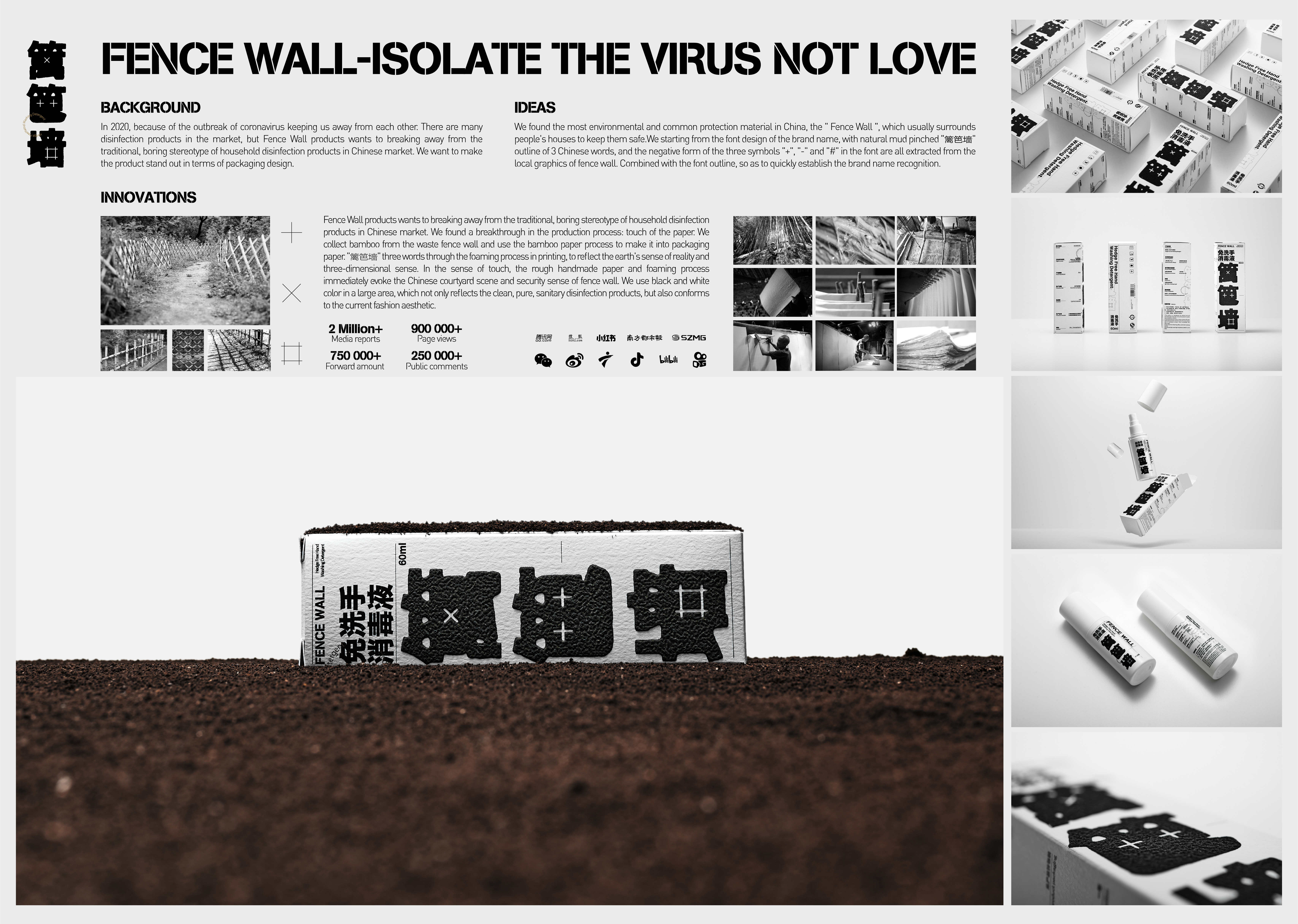
In 2020, because of the outbreak of coronavirus keeping us away from each other. There are many disinfection products in the market, but Fence Wall products wants to breaking away from the traditional, boring stereotype of household disinfection products in Chinese market. We want to make the product stand out in terms of packaging design.
We found the most environmental and common protection material in China, the " Fence Wall ", which usually surrounds people's houses to keep them safe.
We starting from the font design of the brand name, with natural mud pinched "篱笆墙" outline of 3 Chinese words, and the negative form of the three symbols "+", "-" and "#" in the font are all extracted from the local graphics of fence wall. Combined with the font outline, so as to quickly establish the brand name recognition.
Fence Wall products wants to breaking away from the traditional, boring stereotype of household disinfection products in Chinese market. We found a breakthrough in the production process: touch of the paper. We collect bamboo from the waste fence wall and use the bamboo paper process to make it into packaging paper. "篱笆墙" three words through the foaming process in printing, to reflect the earth's sense of reality and three-dimensional sense. In the sense of touch, the rough handmade paper and foaming process immediately evoke the Chinese courtyard scene and security sense of fence wall. We use black and white color in a large area, which not only reflects the clean, pure, sanitary disinfection products, but also conforms to the current fashion aesthetic.


Credits

Entrant Company
Real Projects: Creative Elearning
Category
Website - E-Learning
Country / Region
United Kingdom
Entrant Company
M.AD
Category
Advertising - Advertising / Other___
Country / Region
United States
Entrant Company
Yamamoto Agency
Category
Integrated Marketing - Product Branding
Country / Region
United States

Entrant Company
The Vilcek Foundation
Category
Video - Diversity & Inclusion (NEW)
Country / Region
United States