2021
Zhonghong Decoration VI
Entrant Company
Jingmen Tiancheng Outdoor Advertising Asset Management Co., Ltd.
Category
Corporate Identity - Brand Identity
Client's Name
Jingmen Zhonghong Decoration Engineering Co., Ltd.
Country / Region
China
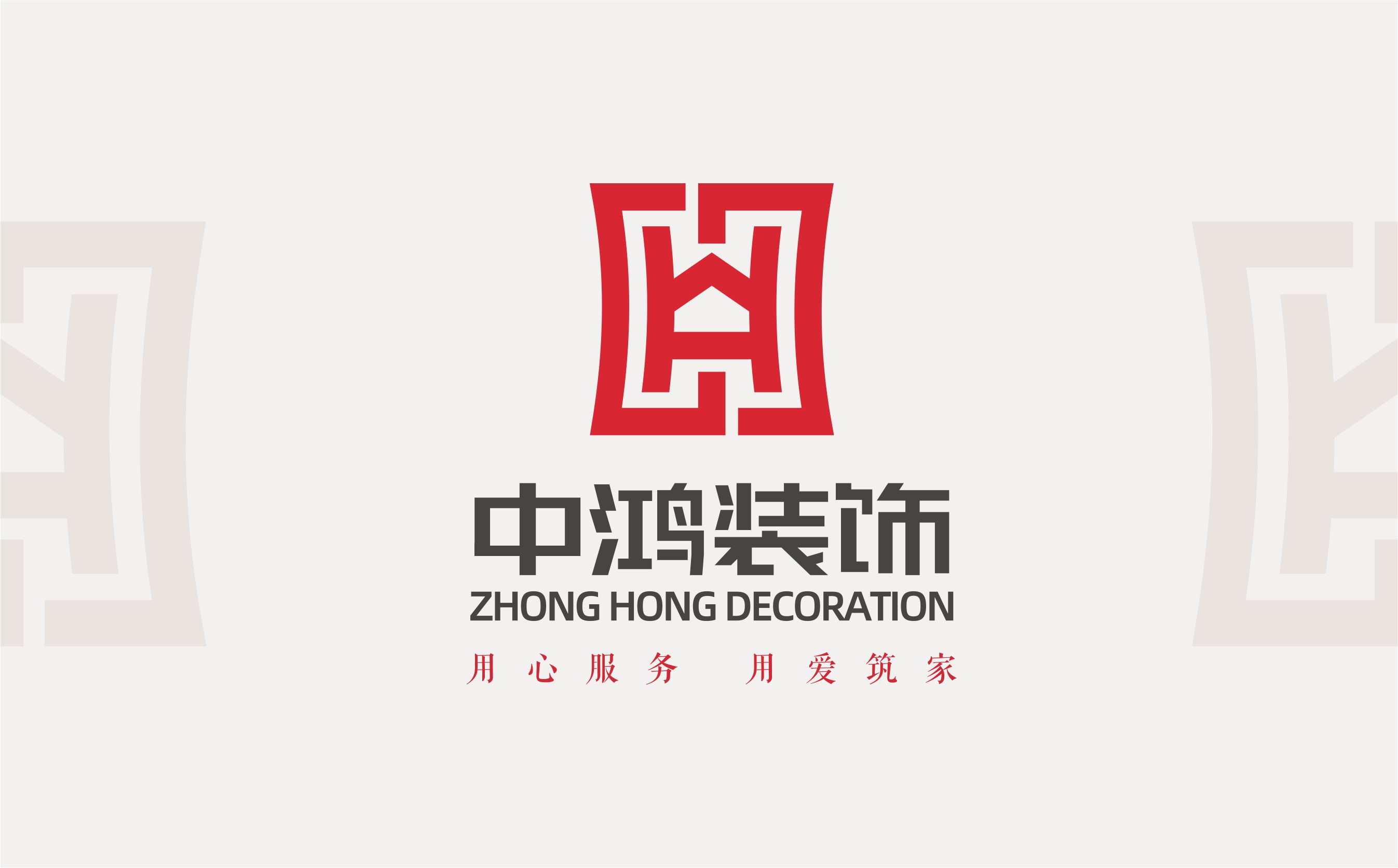
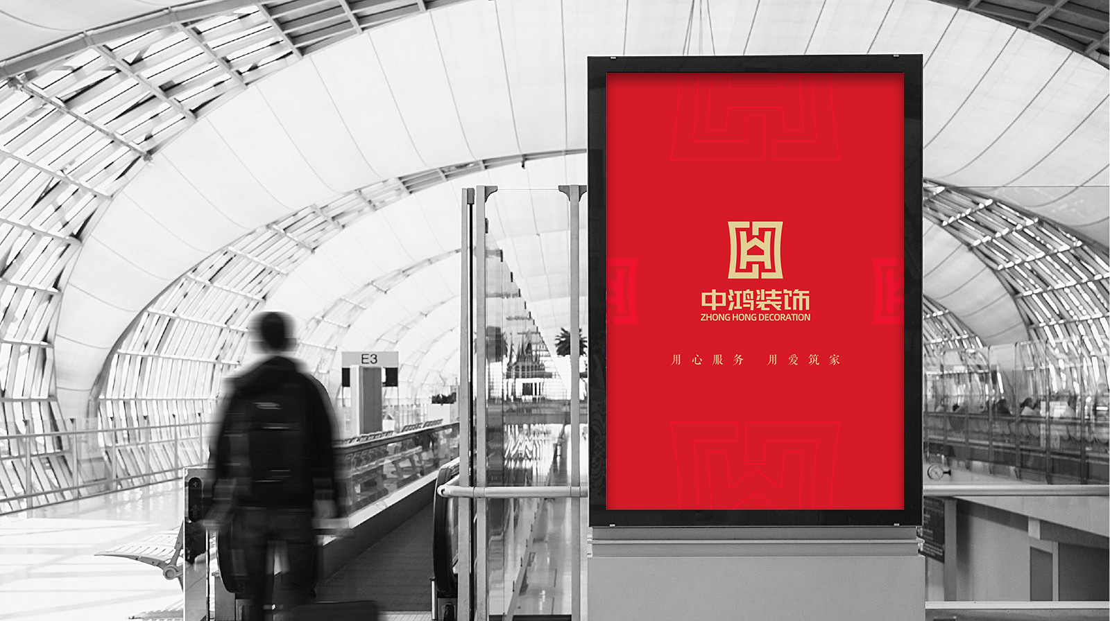
ZHONG HONG DECORATION exists for providing multiple home decorations. Based on the characteristics of its service, the shape of “ZHONG” in its Chinese character and the shape of “H” in “HONG” are combined to form the entire styling of the logo, which resembles an abstract vessel. The ancient Chinese vessel means honesty in Chinese culture, thus indicating that ZHONG HONG DECORATION adheres to good faith in business service. There is a hollow house at the center of the logo, not only expressing the content of our business, but also conveying our client-oriented service philosophy.
Symmetric aesthetics of decoration design runs through the logo design. The geometric order is formed by a simple rectangle and an axis in balanced symmetry, which endows beauty of harmony and orderliness, and visually guides clients to learn our business. The font of the logo is arrayed in order for echoing the tidy and strict arrangement of patterns on the logo and establishing a distinctive visual format. Furthermore, The logo is red-toned for an intense impression.


Credits

Entrant Company
Spherical
Category
Integrated Marketing - Social Media
Country / Region
United States
Entrant Company
DLR Group
Category
Experiential & Immersive - Experiential & Immersive / Other___
Country / Region
United States
Entrant Company
iSpace Home Technology (Beijing) Co., Ltd.
Category
Marketing & Promotional - Illustration
Country / Region
China

Entrant Company
Argyle
Category
Publication - Annual Report
Country / Region
Canada