
2022
Visual Identity System of Chenya Technology
Entrant Company
Xi'an yuyuntu Enterprise Culture Communication Co., Ltd
Category
Corporate Identity - Corporate Identity / Other___
Client's Name
Shenyu Meng, Jie Yao, Xiaoqun Cheng, Zhongyu Zhao
Country / Region
China
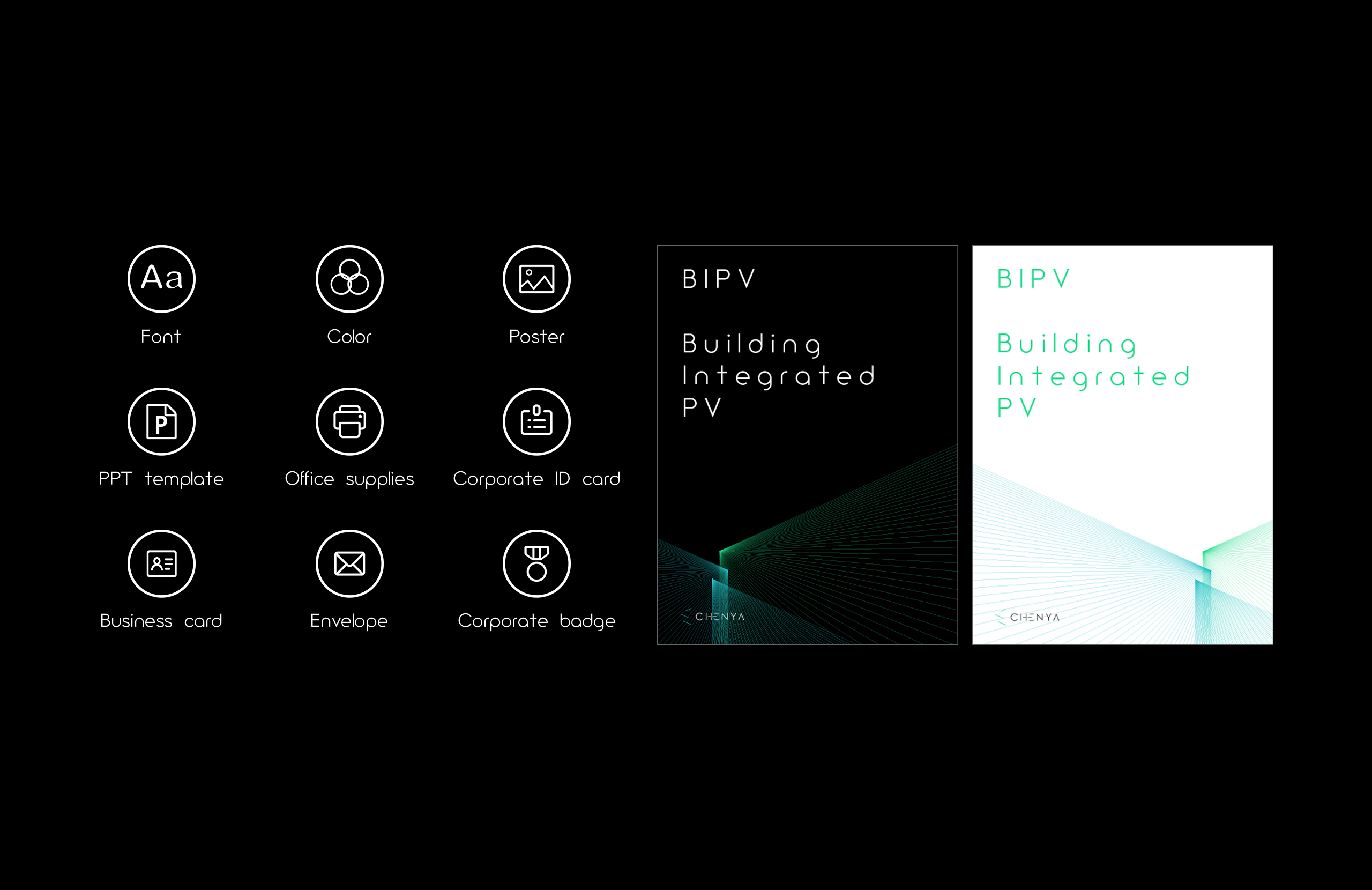
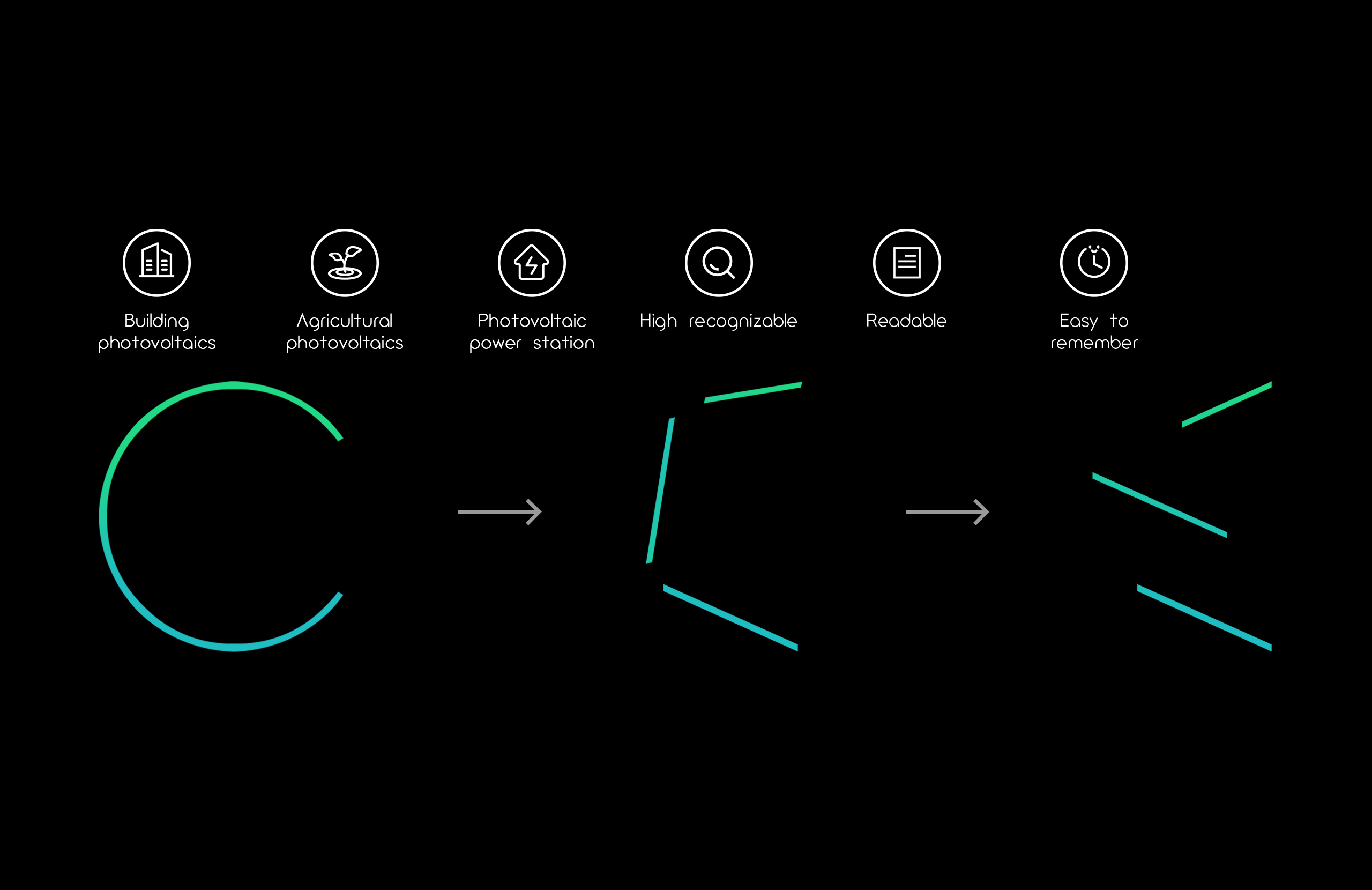
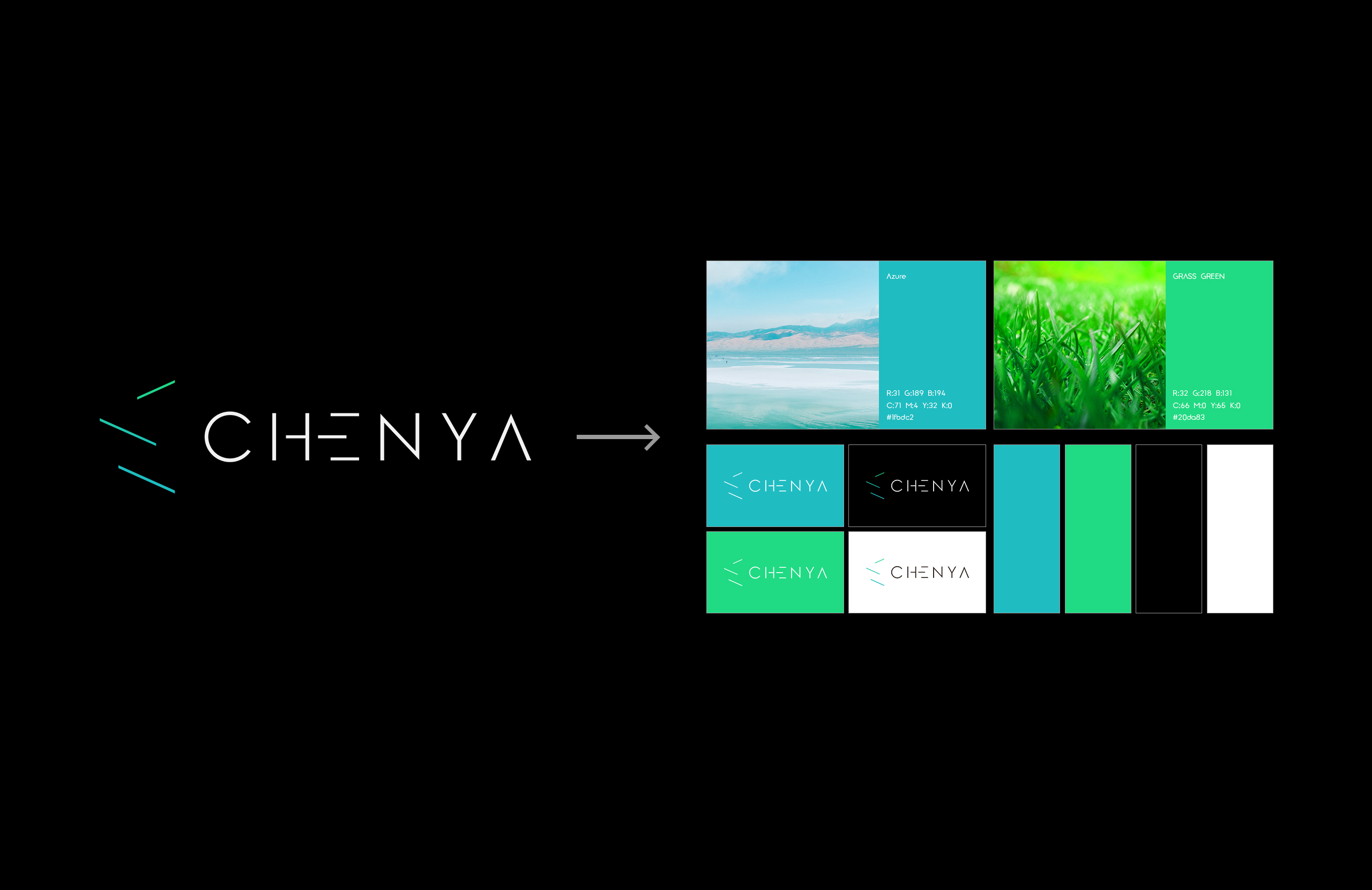
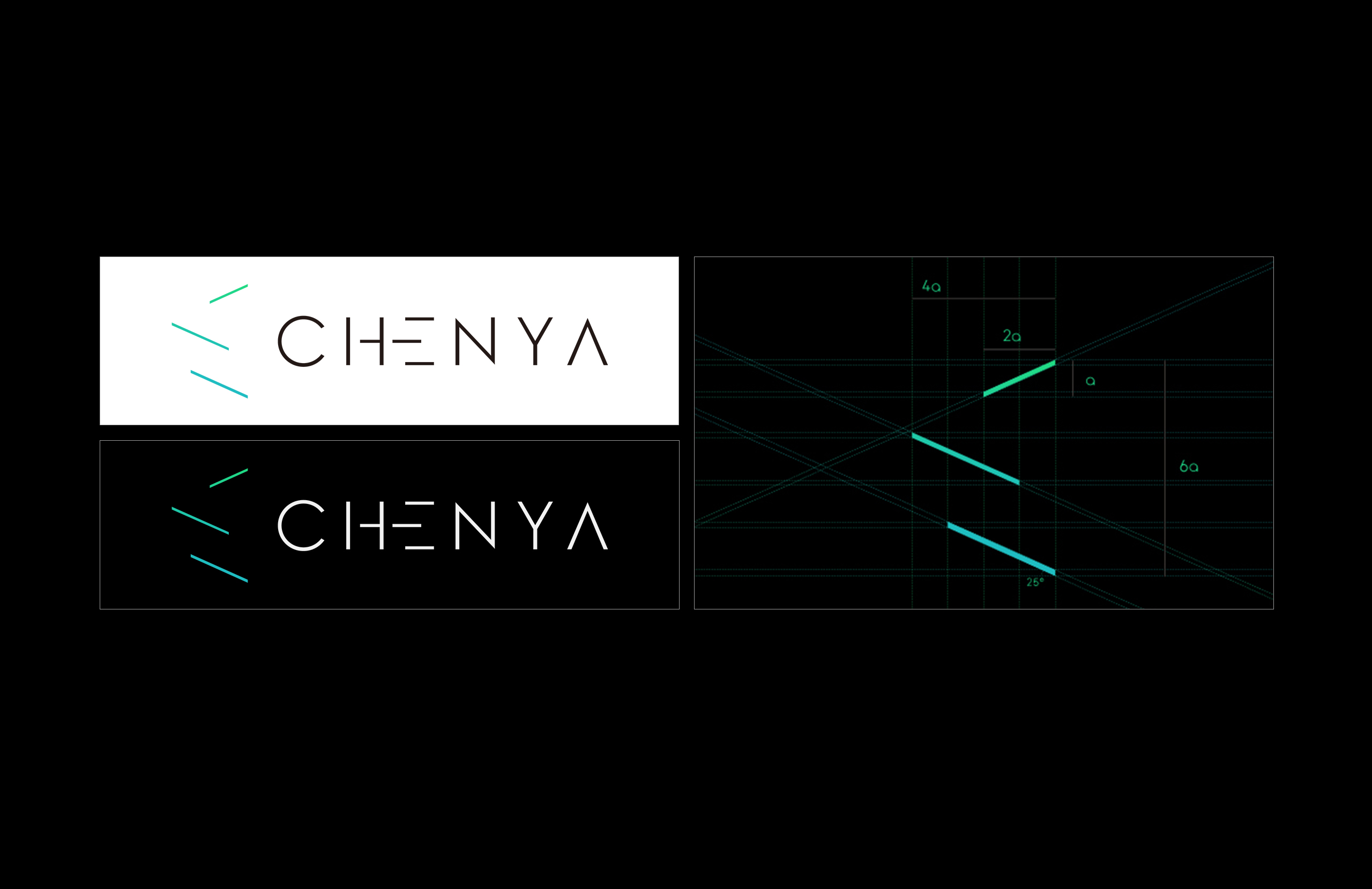
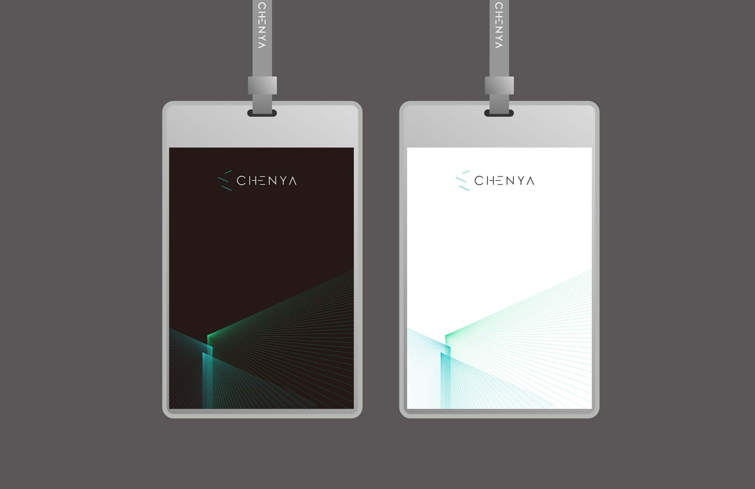
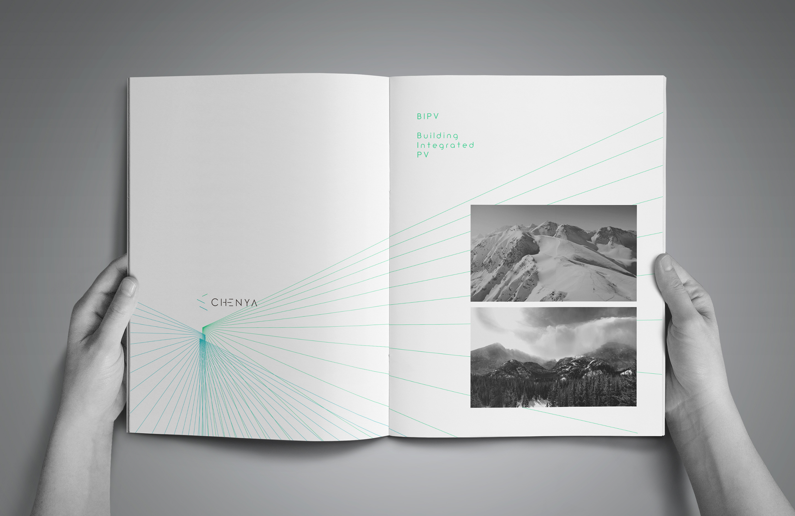
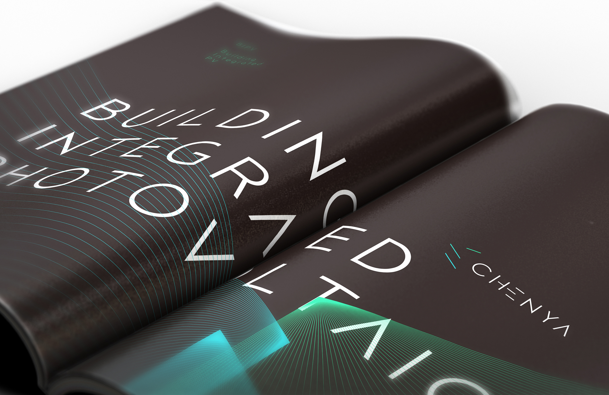
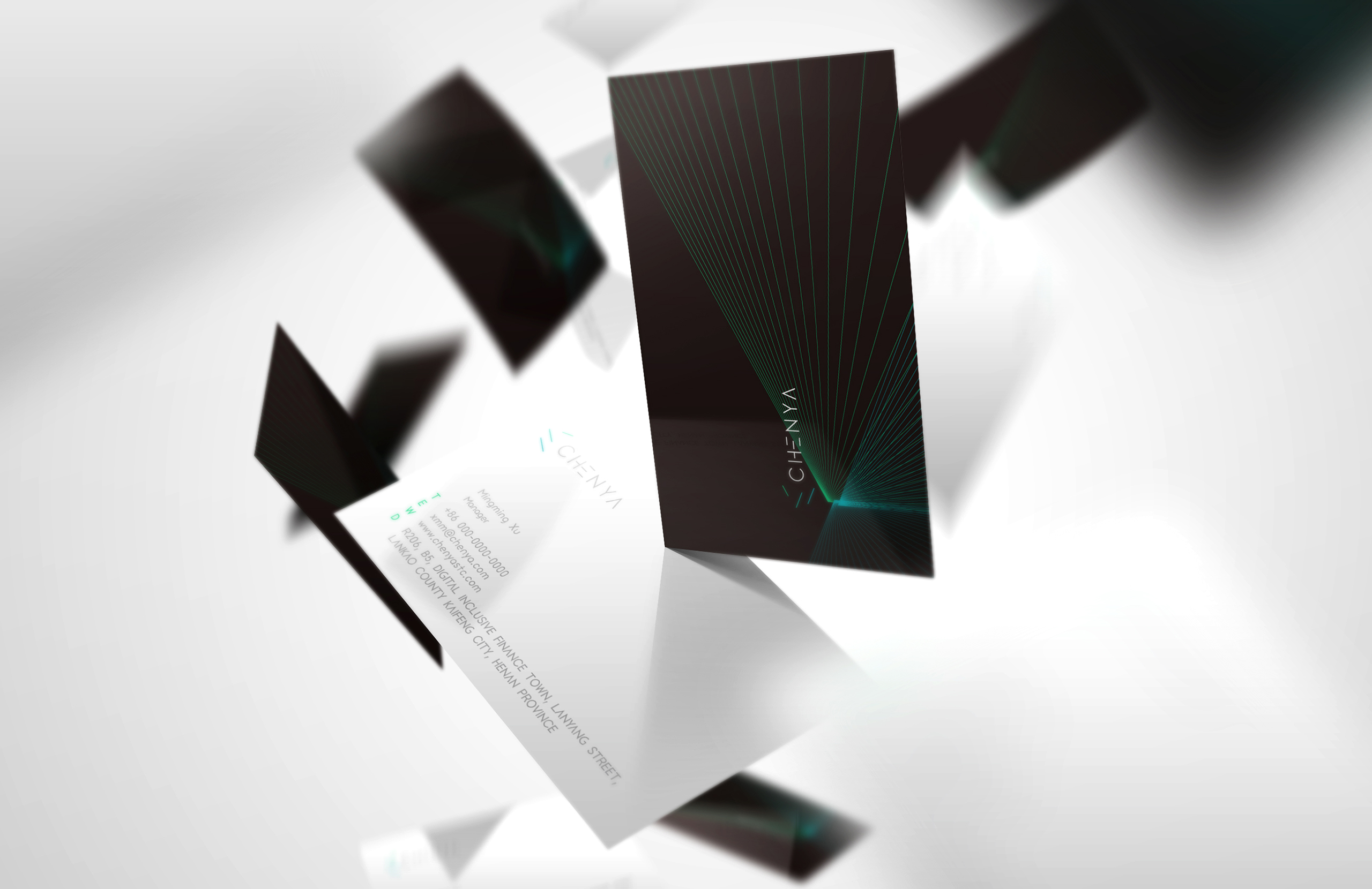
Through a full range of design including fonts, colors, posters, PPT templates as well as office supplies, such as corporate ID card, business cards, envelopes, badges and so on, the personalization of Chenya Technology is displayed in details, bringing a more intuitive experience. Besides, its standardized management and reliability are also shown by establishing a high-end corporate indentity. Additionally, the three graphic effects correspond to three main application fields of Chenya Technology, which not only make its products more recognizable, but also win good will at the first sight, effectively improving the publicity effect. Based on the initial letter C of Chenya Technology, it depicts three beams of light, like the axis of a prism, which intersect with each other after being extended, forming a source of inspiration for innovation, and symbolizing the core value of innovation, integration and vitality. As a super symbol, made up of three beams of light, the graphics of "C" is highly recognizable, readable, and easy to remember, indicating firm’s attribute of multi-field development in architectural, agricultural, and power plants, in line with minimalism. Logo mainly consists of blue-green gradient color like the blue sky and green grass: the light is refracted from the three prisms in a triangular shape, implying the core business of optical solar materials in the field of new energy, as well as the bright vision of advancing in the three dimensions of construction, agriculture, and power plants, which are in line with the theme of new energy photovoltaics, symbolizing the diversified development, inclusiveness and acceptance of Chenya Technology. The sense of vitality it owns shows its brand attribute of dynamic and innovative. Also, the high standards and strict specifications are hiding behind the excellent quality. With its regular distributed geometric design, it emphasis the rigorous routine in the work. The blue-green gradient symbolizes new energy, and the main color of light gray font is in line with its innovative, pure and concise color attributes, bringing a visual experience full of technology. In addition, the diversity of color and graph vividly summarizes the development route of the company.

Credits

Entrant Company
Surf
Category
Video - Animation
Country / Region
United States

Entrant Company
Broth
Category
Video - Educational
Country / Region
United States

Entrant Company
West Metro Fire Rescue
Category
Video - Government
Country / Region
United States
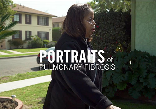
Entrant Company
Skalawag Productions
Category
Video - Health & Fitness
Country / Region
United States