
2023
Rennicks
Entrant Company
The Pudding
Category
Corporate Identity - Brand Identity
Client's Name
Rennicks
Country / Region
Ireland
Rennicks has been working in the highways and vehicle registration plate sector since 1976. The company has a commitment to forging deep connections and delivering innovative solutions to complex challenges for its clients. Having reached a critical juncture, the brand realised its business ambitions could only be realised with the support of a dynamic new brand identity that would help them cut through the noise in a busy marketplace. They needed a brand identity that would pay homage to their heritage while, at the same time, propelling them toward their future goals. That's where we came in. The starting point for creative ideation was looking at the brand's heritage. It was crucial that the lineage of the highways sector would be woven into the tapestry of this new brand identity in a subtle but modern way. The result is a visual language made up of core components that nod to the industry itself. The wordmark is one of the brand's most defining features, carefully balanced in all caps. Set in a fixed configuration, the R reaches to the E to signify the joining partnership between Rennicks and its clients. The brand identifier also conveys collaboration, with the R shape representing the Rennicks team and the circle representing the community of organisations and individuals whom they work with. Rennicks' palette follows similarly, with colours carefully chosen as a legacy of signage on motorways and roads. As for the fonts, Acumin Pro and Transport Medium, give the tone of voice structure, integrity and strength, while the dynamic pattern is derived from repeat patterns of warning lights and safety products. A final and crucial piece of the puzzle was the creation of new photography for the brand. Consisting of three styles – action shots, still life and focal shots – the photography helps activate the brand and add a human quality to the newfound identity. Combined, all of these elements create a refreshed and refined identity. The result is a dynamic new brand that can help set Rennicks apart from its competitors and support the brand through its next wave of growth.


Credits

Entrant Company
The MRN Agency
Category
Event - Virtual Event
Country / Region
United States
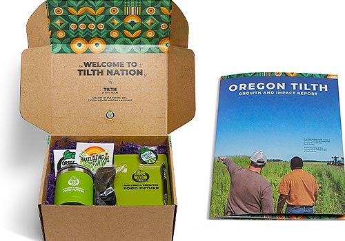
Entrant Company
teamcomm@tilth.org
Category
Branded Content - Non-Profit
Country / Region
United States

Entrant Company
Audacity Health
Category
Branded Content - Healthcare & Pharma
Country / Region
United States
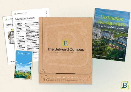
Entrant Company
CBRE Calibre Creative Group
Category
Marketing & Promotional - Media Kit / Sales Kit / Folder
Country / Region
United States