2023
Chengkan Yun Zhuan Font Design
Entrant Company
HEFEI NORMAL UNIVERSITY
Category
Typography - Typefaces / Font System
Client's Name
Country / Region
China
The names of 22 ancient buildings in Chengkan, a town with a history of thousands of years in Huizhou, serve as the major design content for this creative font. Meanwhile, through in-depth excavation of the architectural elements in traditional Huizhou architecture (such as the horse head wall, cornices, thick beams, Huizi patterns, etc.), integrated with seal script fonts (retaining the characteristics of ancient pictographs, with strong decorative features), it is a continuation and development of the traditional Huizhou architectural language. This creative font not only shows the profound historical and cultural heritage and artistic charm of traditional Huizhou architecture, but also promotes the protection and development of Huizhou architectural culture in Chengkan ancient villages, breathing new life into traditional Huizhou architecture, which is fresh and vivid.
Some of the font’s strokes are replaced in the design by representative architectural components of Huizhou architectural culture in Chengkan ancient villages. The creative effect of the perfect arrangement of characters and pictures is produced by keeping the identification of the font itself.
For example, it uses the structural form in Huizhou architecture - the horse head wall - to replace the horizontal strokes and the upper part of the radicals in the strokes, and performs a treatment similar to cornices on the horizontal strokes of the font, vividly displaying Chengkan architecture characteristics.
The thick beams of the Huizhou architectural culture in Chengkan ancient villages are integrated into it, which increases the weight of the font and pulls away the change in thickness.
Combining the font structure and the Huizi pattern with strong decorative features according to the strokes of the font, replacing some of the strokes, endowing the font a traditional decorative effect.
In terms of the font strokes, the stroke structure of the seal script is retained, the strokes that are not highly recognizable in the text itself are simplified, and the square and long strip effect is uniformly used. And the original implication of the Eight Diagrams is retained and applied to the font, showing the integrity and maximum viewing comfort, reaching the perfect golden ratio, creating a mysterious feeling.


Credits
Entrant Company
The Social Psychic Radio Show
Category
Audio - Podcast
Country / Region
United States
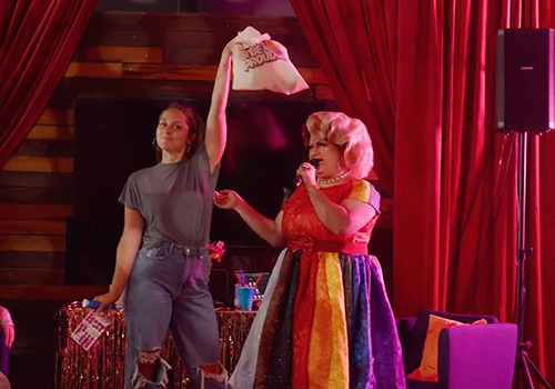
Entrant Company
PPK
Category
Video - Diversity & Inclusion
Country / Region
United States
Entrant Company
Graphite Creative
Category
Corporate Identity - Logos
Country / Region
United States

Entrant Company
Infernozilla
Category
Social Media - Community
Country / Region
United States