2024
CUI SHAN YU
Entrant Company
Play Design Lab
Category
Corporate Identity - Brand Identity
Client's Name
CUI SHAN XUN
Country / Region
Taiwan
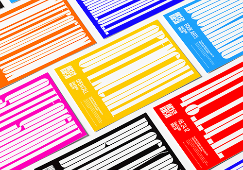
CUI SHAN YU, a subsidiary brand of CUI SHAN XUN, is dedicated to delivering exceptional travel experiences with a special focus on Taiwan's indigenous tribal and rural regions. We emphasize low-carbon, sustainable, and locally rooted traditional cultural travel experiences. While CUI SHAN XUN primarily engages in selling a wide range of agricultural products and cultural merchandise from tribal communities, utilizing strategies for local revitalization to bring visibility to these unique industries, CUI SHAN YU specializes in offering meticulously crafted travel itineraries as a sub-brand.
In terms of visual identity design, it is paramount for CUI SHAN YU to maintain visual consistency with the parent brand, CUI SHAN XUN, ensuring that consumers effortlessly recognize both as part of the same overarching entity. Simultaneously, this design strategy aims to highlight the distinctive features of each brand. Given that developing an entirely new identity system with fresh design vocabulary would disrupt the established identity of CUI SHAN XUN, the visual identity of CUI SHAN YU builds upon the fundamental elements of CUI SHAN XUN.
The existing logomark, which includes symbols such as "mountain" and the "Sising" bird (a significant bird in the Seediq culture), has been dissected and reimagined. Through the strategic combination of these symbols, a brand new visual language has emerged, one that emanates the essence of "Indigenous Totems" with a strong emphasis on "Mountain, Nature, and Sustainability." This fresh visual identity conveys the brand's unwavering commitment to promoting indigenous cultural experiences and the core values of ecological sustainability and environmental restoration.
CUI SHAN YU's visual identity serves as a bridge between tradition and innovation, uniting the past with the future while preserving the core essence of CUI SHAN XUN. This creative approach encapsulates the brand's mission and values, making it a compelling choice for the strategic design branding.
Credits


Entrant Company
6JUNFENG LAB.
Category
Corporate Identity - Brand Identity
Country / Region
United States

Entrant Company
Robinson Creative Inc
Category
Website - Travel
Country / Region
United States

Entrant Company
WMUL-FM
Category
Student Submission - Student Audio
Country / Region
United States


Entrant Company
AIS Network
Category
Website - Website / Other___
Country / Region
United States


