2024
Miramar Group’s Logo Rebrand
Entrant Company
Miramar Group
Category
Corporate Identity - Logos
Client's Name
Miramar Group
Country / Region
Hong Kong SAR
Miramar Group, founded in Hong Kong in 1957, has witnessed the growth and development of the city. With the distinction of being the first hotel in Hong Kong to join the International Design Hotel Networks, Miramar Group has always embraced a design-oriented and stylish approach in the hospitality industry. As the group celebrated its 65th anniversary in 2023, it took this opportune moment to undergo a logo rebrand, reflecting its evolution as a modern and dynamic brand committed to providing premium customer experiences in Hong Kong.
Miramar Group aims to set trends and create truly "MIRAvellous" moments for its customers in various domains, including shopping, dining, hotels, and travel. Each encounter with Miramar Group is designed to be unique, genuine, and memorable, offering unparalleled experiences that surpass expectations.
The centerpiece of the logo rebrand is the new emblem, which embodies Miramar's three "M" philosophy: Modern, Masterful, and Memorable. Crafted with fine lines and dynamic wave flows, the emblem intertwines to amplify the depth and dimension of the symbolic "M" shape. This design not only establishes a strong connection to Miramar Group but also represents the vitality and diversity of its various businesses in the hospitality sector. It signifies the Group's commitment to delivering pleasant and stylish experiences to customers in all aspects of their journey.
With its refined and contemporary design, Miramar Group's new logo captures the essence of the brand's evolution over the past 65 years. It represents the Group's unwavering dedication to providing exceptional customer experiences, as well as its forward-thinking and innovative approach to the hospitality industry. Miramar Group continues to shape the future of Hong Kong's hospitality landscape, enriching the lives of locals and visitors alike with its signature blend of style, elegance, and genuine hospitality.


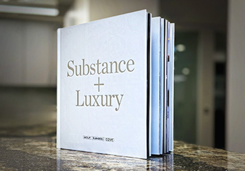
Entrant Company
History Factory
Category
Publication - Book
Country / Region
United States

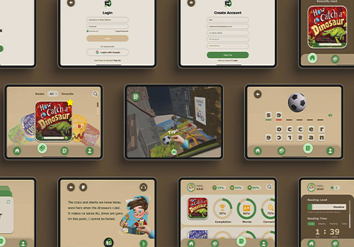
Entrant Company
Spectrio
Category
Video - Recruitment
Country / Region
United States
Entrant Company
UNIVERSITY OF SOUTHERN CALIFORNIA
Category
Student Submission - Student Games
Country / Region
United States
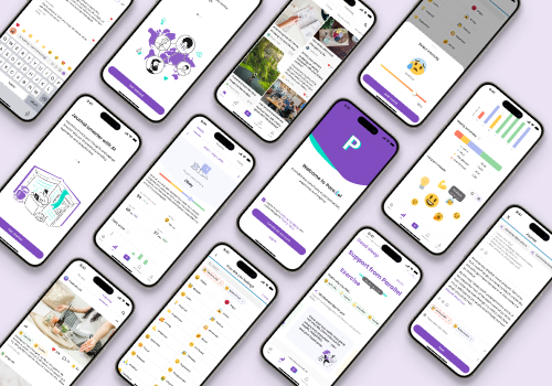
Entrant Company
Yuqi Cao
Category
Mobile App - Social Networking
Country / Region
United States