2024
U.PROTEC
Entrant Company
U.Protec (Shenzhen) Tech Co.,Ltd
Category
Corporate Identity - Logos
Client's Name
Country / Region
China
The design of the U.PROTEC Logo is inspired by traffic lights, adhering to the philosophy of "Protect Your Live Every Moment." Both the color scheme and the meaning embedded in the Logo echo the language of traffic lights. The Logo beautifully encapsulates the company's values: dedication, expertise, and innovation, striving to create value for customers, benefit employees, and pursue outstanding performance. With a craftsman's spirit, we aspire to become a globally renowned brand in protective equipment, guarding lives and shaping the future.
The overall Logo image centers around a triangular formation, with the English and Chinese names of the work stacked vertically beneath. Composed of three equilateral triangles, it ingeniously integrates the colors red, orange, and green, each symbolizing the prevention of hazards and accidents, the provision of protection and warning, and the safeguarding of safety and life. The interlocking triangles create a dynamic visual, emphasizing the progression of these values while also exhibiting the vitality and strength of the brand.
The progression of colors represents the complete process from identifying danger (red), taking action for protection (orange), to ultimately achieving a safe state (green). This simultaneously symbolizes the comprehensiveness and systematicity of U.PROTEC's brand in the field of safety and protection.
The design language of the U.PROTEC Logo is perfectly embodied in our products. The triangular Logo signifies the solid protection offered by U.PROTEC's products, reliable as a triangular structure. U: Not merely an abbreviation for YOU, it embodies the personalized and customized security solutions that U.PROTEC offers to YOU, the user, catering to diverse needs. Additionally, "U" stands for UP, symbolizing our constant pursuit of excellence and commitment to providing exceptional protection to our users.
PROTEC: Beyond simply representing protection, it also signifies the brand's sense of social responsibility, dedicated to delivering safe and reliable products and services to society.


Credits
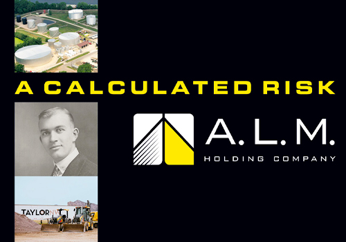
Entrant Company
Write Stuff Enterprises
Category
Publication - Book
Country / Region
United States
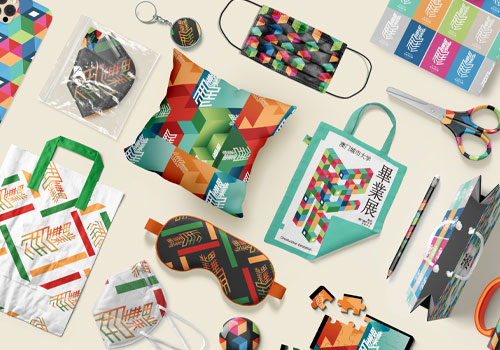
Entrant Company
/
Category
Student Submission - Student Visual Effect
Country / Region
China

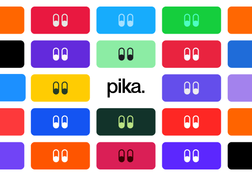
Entrant Company
Spire Agency
Category
Website - Business to Business
Country / Region
United States
Entrant Company
Lazarev. — AI&Digital Product Design Agency
Category
Website - Professional Services
Country / Region
United States