2025
Health Guardian Sprite IP Character Design—apple e
Entrant
ZhongAn Online P&C Insurance Co., Ltd.
Category
Corporate Identity - Corporate Identity Redesign
Client's Name
Country / Region
China
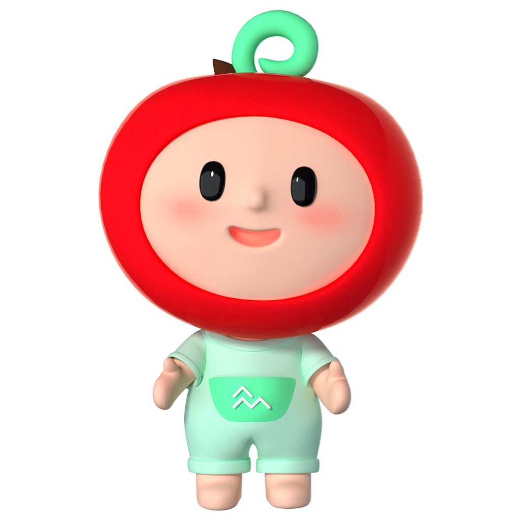
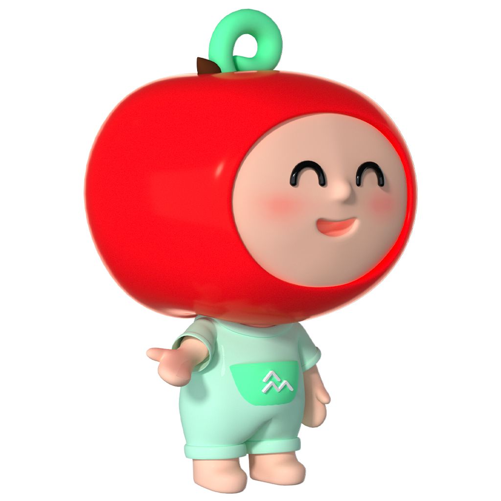
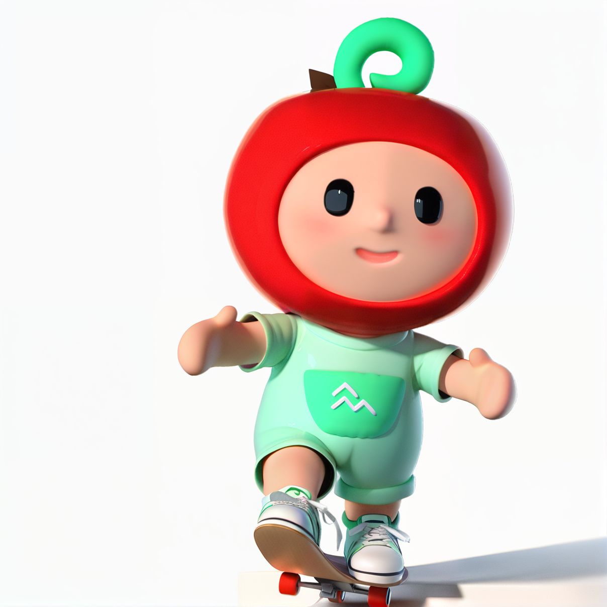
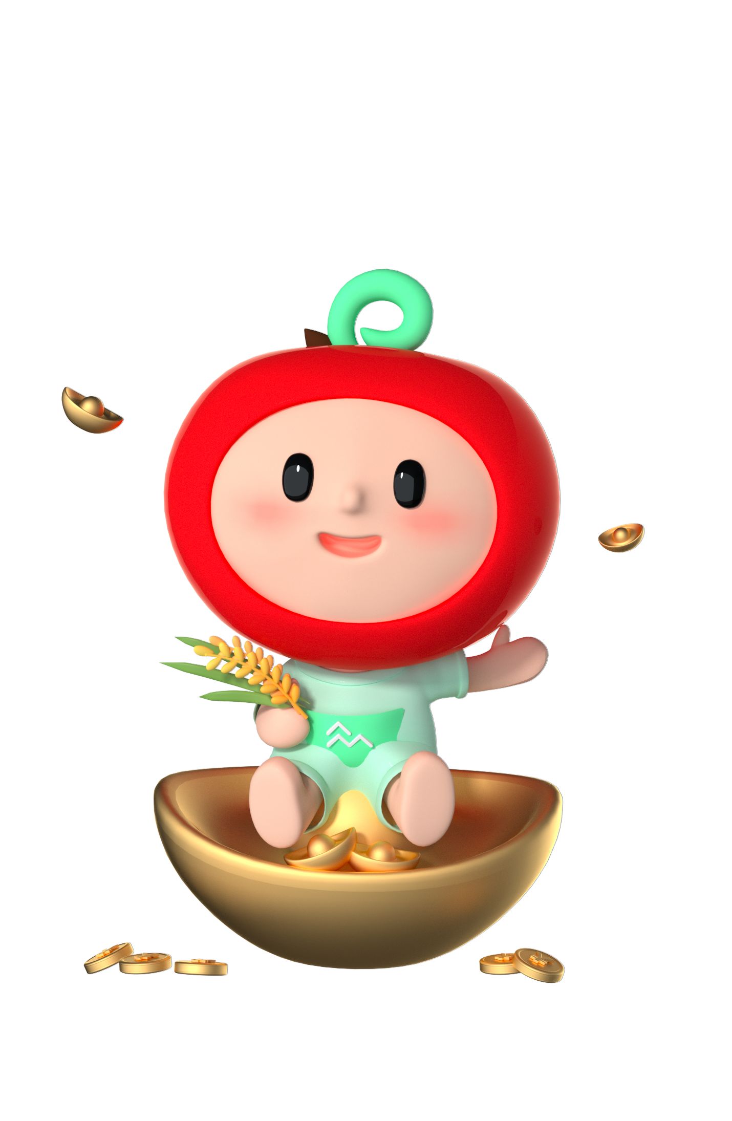
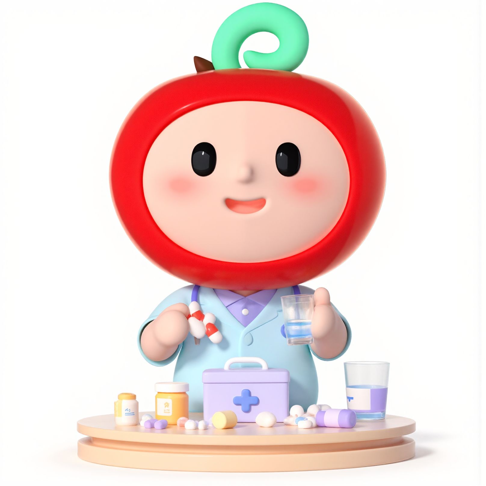
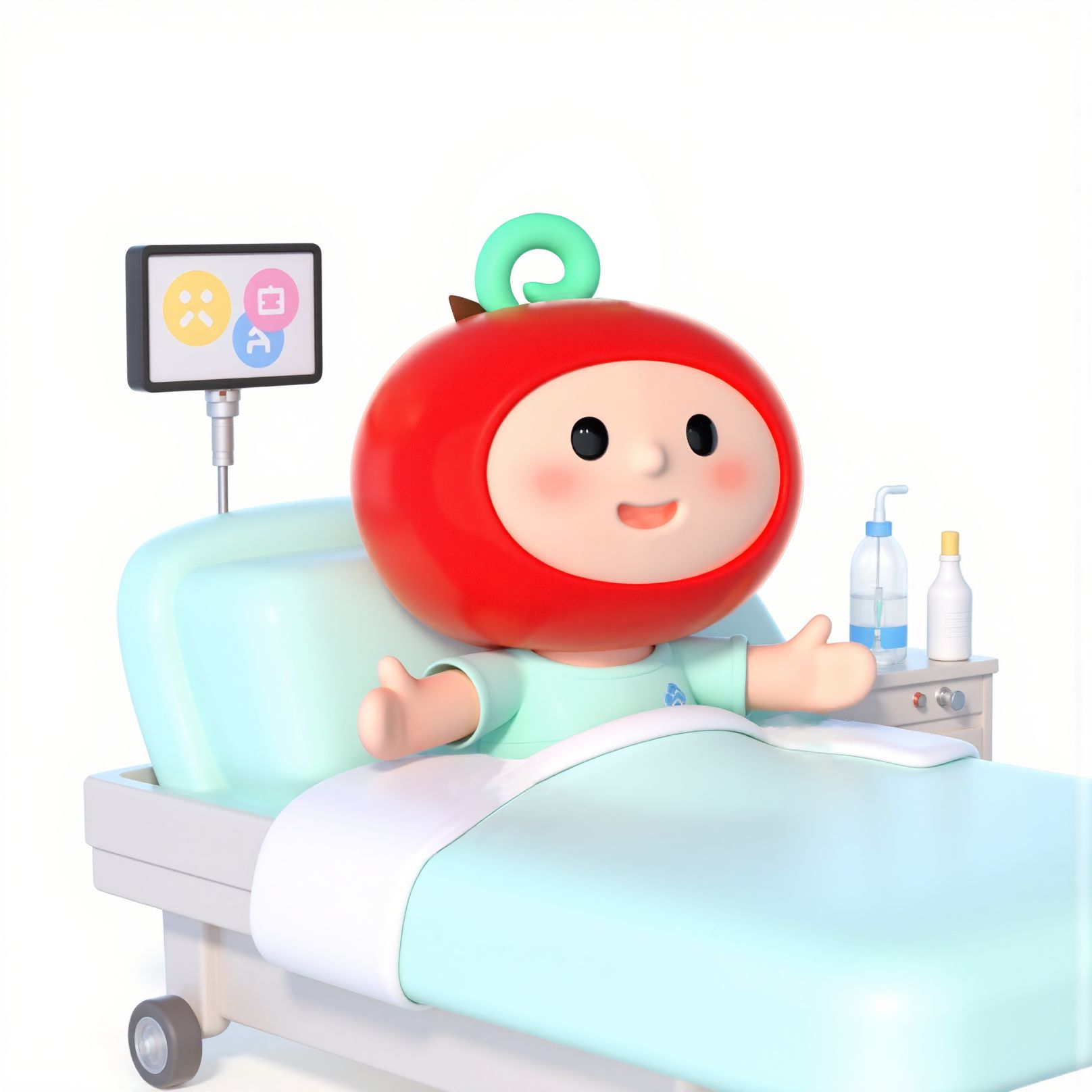
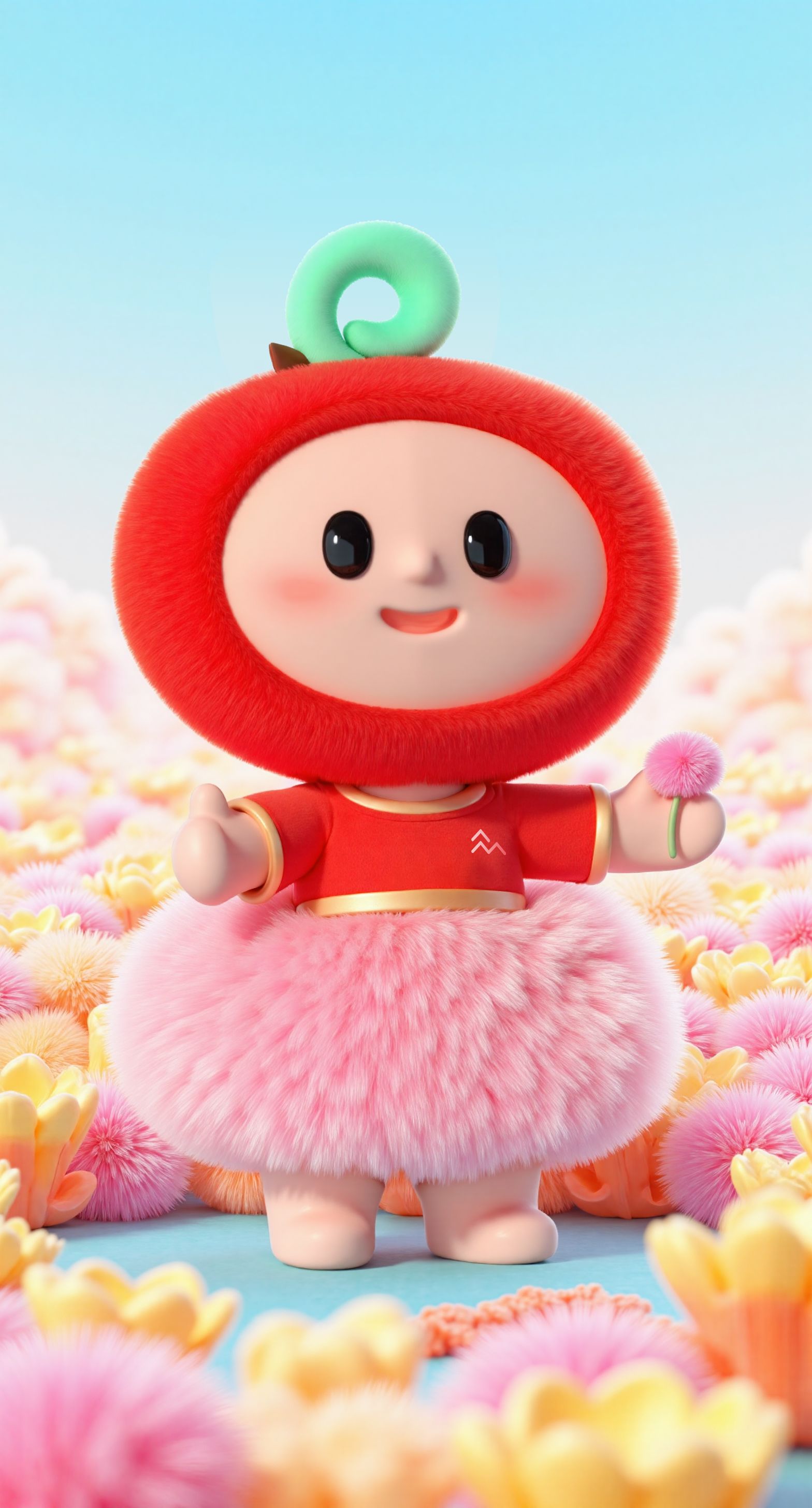
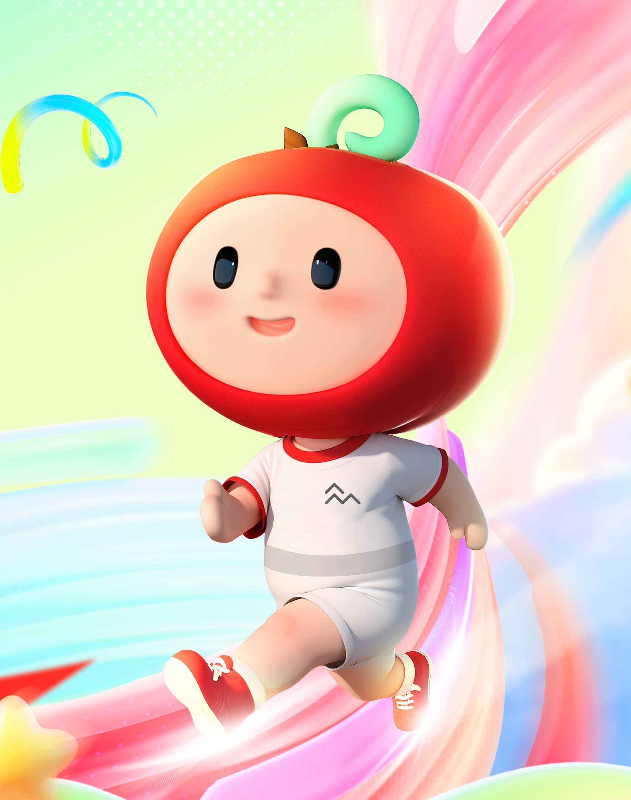
Apple e, the brand IP newly launched by ZhongAn, accompanies users throughout their journey from purchasing insurance to utilizing services. Its personified design aims to break the stereotype of serious insurance and health services, conveying the brand value of “warmth covers insurance”. As an approachable health guardian elf, apple e employs a scenario-based strategy to visualize the brand’s deep care for users, redefining visual interpretation of health services.
In terms of aesthetic design, apple e, centered around the concept of “health protection and warm companionship”, innovatively integrates the apple (a symbol of health and safety) with the tech-inspired letter “e” (the brand’s core product ZunXiang e Sheng). The green leaf atop the apple is transformed into an e-shaped energy ring, embodying the brand’s firm determination to safeguard users’ health and its powerful strength in digital technology. The green jumpsuit is adorned with the brand logo to emphasize the ownership of the IP, helping to improve brand recognition and awareness.
Following the principle of blending simplicity with playfulness, apple e combines smooth curves with geometric shapes, and its proportions are meticulously designed to create an adorable Q-version image. This well caters to public aesthetic preferences and enhances users’ emotional engagement. The apple-shaped head and the cylindrical body utilize curved transitions to add a gentle, harmonious, and natural aesthetic. Additionally, the face design focuses on details, with cute expressions and big bright eyes giving a sense of approachability, bringing the brand and users closer.
The color palette of apple e echoes the theme of health. The head in vibrant red symbolizes vitality and passion; the jumpsuit in calm green represents health, nature, and liveliness. The two colors complement each other, not only giving a fresh, comfortable visual effect but also highlighting the brand’s devotion to health services.

Credits
Entrant
Double Tap
Category
Outstanding Agency Awards - Outstanding Small Agency (Up to 25 employees)
Country / Region
Spain
Entrant
insglück Gesellschaft für Markeninszenierung mbH
Category
Experiential & Immersive - Live Experiences
Country / Region
Germany
Entrant
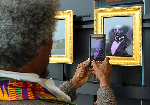
Blue Telescope
Category
Experiential & Immersive - Exhibition Experience
Country / Region
United States
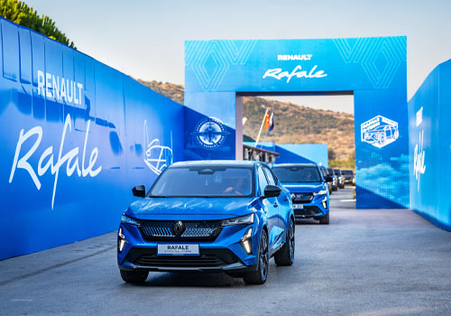
Entrant
Ogilvy 4129 Turkey
Category
Social Media - Event / Live Event
Country / Region
Turkey